Showing posts with label Ayonna. Show all posts
Showing posts with label Ayonna. Show all posts
9 May 2014

20 March 2014
24 February 2014


23 February 2014


21 February 2014
Digi Pak Poster - The Trials
Here we were Testing a trial and error idea's for the poster Cover.


Final Product of the Test
inspired by- Neck Deep album Cover

13 February 2014
Music Video Analysis - The script
Music Video Analysis
The Script - Breakeven
This music is mainly in black and white. At the beginning you can hear a non-diegetic voiceover of his love interest; this could be him replaying in his mind. It has a typical concept of the genre, the band performing but to a live audience. The music video is a narrative and shows the leas singer broken hearted and remembering times with his love interest.It includes flashbacks of their time together, but they are in colour unlike the rest of the music video. This could be to reflects his mood as he is down and upset in the present day and the memories are happy therefore are colourful. He is singing on his own to the camera and also watching videos of the two of them together. There is a longshot in the video where they are holding hands and then slowly let go of eachother, this could signify their relationship ending and that he needs to let go. The performance of the band towards the end is in slow motion. Some of the camera shots are as if they are using their own camera, this is to show the romance between the two of them and to make it more personal and believable. The costumes are casual; jeans and t-shirts, jumper, coat and scarf. The performance shows the genre characteristics that Andrew Goodwin writes about in his theory on music videos. There is a use of camera filters as the video is mostly black and white.


music video analysis - Nirvana
Nirvana - Smells Like Teen Spirit (Analysis of technical, visual and genre codes)
 There are multiple close-ups and mid shots of the lead singer, with the camera angle generally being focused directly facing the star (Kurt Cobain). This emphasizes his star image, as he is continuously seen playing his guitar which indicates his ability as a musician, also the care-free and effortless way he is represented further supports the idea he is a grunge/rock artist, which relates to the target audience who are reformers, as they take into account his rock star image. The star is pictured building up the enjoyment of the stereotypical, homogeneous teenagers who are seen 'headbanging' in the audience, which relates to the song title 'teen spirit' as it shows young males and females enjoying their youth. However the stereotypical image that has been constructed of a teenagers, as being wild and causing trouble is shown in this video, as it draws to an end the large number of youths take to the floor staring fire's and damaging the bands equipment.
 |
| Circle - A |
The music video is appeared to be shot a American High School pep rally, the camera pans from the lead singer multiple times to show high school cheerleaders. However these cheerleaders appear transgressive as on their outfits is the circle-A which long predates the anarcho-punk movement, which was part of the punk rock movement of the late 1970's. This somehow puts across the representation that the band, and the punk rock/grunge music of that time, was somewhat of a great deal to teenagers. It represents the band as influential and powerful as they influence many teenagers with their music. This in some way shows the ideology behind the music video, as it shows that the band wanted to be represented as strong and inspire youth with their rebellious nature.

The narrative is mostly performance as you are often shown images of the band playing their instruments throughout the video, however as seen there is some concept and abstract idea in the foreground. The fast paced editing of the video, emphasizes the intense and dramatic tone of the grunge music, the low key lighting and evident smoke machine also add to the hectic nature of the rock and roll stars. In the mise-en-scene nothing is completely heavily constructed and the musicians are represented as very much themselves, compared to an artist like Lady Gaga who almost creates an alter ego in music videos by dressing in strange and wonderful ways. The lead singer has the stereotypical image of a rock star with long hair and almost 'shabby' looking clothing.
Analysis of generic conventions
ANALYSIS OF GENERIC CONVENTIONS
GENRE – INDIE
INDIE MUSIC VIDEO 1 – PRINCESS CHELSEA MUSIC VIDEO 2 – JAKE BUGG MUSIC VIDEO 3 – TWO DOOR CINEMA CLUB
NARRATIVE –
Soft tones, light hearted, warmth, unique, smoky, passionaite.
STAR IMAGE –
Trendy, different, retro, muted colours, natural or fake hair and make up, normal clothing.
THEMES –
Love, lust, lost, youth, memories, adventure, fun, missing, upset, danger, illness.
MUSIC –
Steady, slow, guitar, drum, no upbeat tones, no strong chorus change.
MISE-EN-SCENE –
Costume – natural, trendy, typical. Lighting – natural, high key, low key. Action – muted, natural, simplistic. Make-up – muted, natural. Props – related to music video, instruments. Setting – Amsterdam, a boat, hot tub.
CAMERA TECHNIQUES –
Pans, whips, close ups, tracks, mid-shots, establishing shots, master shots, wide angle shots.
EDIT AND EFFECTS –
Instagram and retro effects. Diluted colouring – blue, green, orange, white, monochrome, light flashes.

Digipak Analysis
Digipak Analysis
CD Digipak Analysis
 | |
| Layout 1 |

Indie Example 1:
- Unusual folding layout, with 4 panels all folding outwards in different directions instead of the usual net format.
- Each band member on a different panel with a picture of their face - and in different colours.
- The central panel (behind the CD) should a rainbow of colours each representing a different band member, and the colour represents the passion 'behind' the music and the coming together of the band.
- When you open up the Digipak it's like opening up the band and getting behind the scenes.
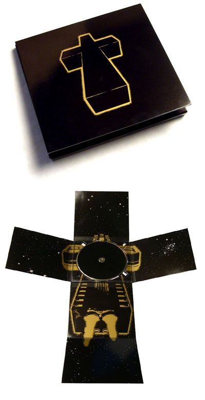
Indie Example 2:
- The neon cross on the cover of the case could represent that the fans follow the band as if they are a religion.
- The front cover does not even include the name of the band or album, only the religious 'Cross' imagery that has become synonomous with the band - with reference to track titles such as 'Genesis' and 'Waters of Nazareth'. They don't need their name in massive letters to be recognised, only a simple cross logo.
- The Digipak then folds out with 6 panels to create a larger cross shape, with no text inside, only alternative artwork of the neon cross now shown as a spaceship flying through space - with stars shown on all the adjoining panels.
 |
| Layout 2 |

Indie Example 3:
- This artist has decided to go for a more intricate layout, with multiple pullouts containing text/logos and imagery instead of the more simplistic designs seen in the previous examples.
- The stone background could represent the industrial electronic feel to their music.
- However it contains the same 'Booka Shade' logo on every panel and pullout in their own signature font which has become their brand, and the CD tries to continue this by having the band name take precedence over the actual album title.
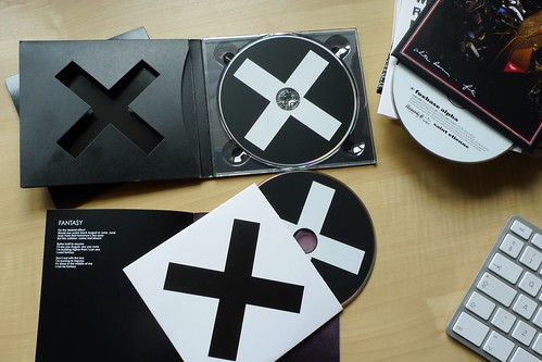
Indie Example 4:
- For the XX the band used a simple black and white X - in alternating colours. This stunningly minimalistic design strongly reflects the bands style of music - simplistic and calm.
- It creates an air of mystique around the band, as it does not contain any information on the front cover as to reveal who the band are or what the album title is.
- In a similar way to the Justice album shown above - the fans are made to recognise the band through a simple logo. Which is a feature I may choose to implement in my own digipak design.
- Another interesting feature is the cut out X on the front panel (shown top left in the picture) when the album of closed this will show the white X on the CD through the gap in cover - giving the digipak some depth and seperates it from the rest of generic jewel cases on sale in the shops.
11 February 2014
Indie Digipak Research
Indie Digipak Research

The cover is of the band standing in a shop window, they are dressed and standing casually this reflects their laid back style and the presence of instruments show that this is mostly how their music is made, just their voices and instruments, they’re not computerised. The font is traditional and simple but with flair, which again reflects their style of music.
The back cover is a picture of a window, this would be the back of the shop window, this works well because of front of the shop being on the cover. The layout of the back cover is very simplistic; they give the impression that they are a very independent, pure, small town band.
The picture inside is them sitting in a window of the same small shop/unused building. They are all very relaxed and laid back, they are all shown as the same size, so no band member is more focused or important than the other, they are an equal band but also it can show that they are still all individuals with their own talents and contributions to the band.
The left side of the inside of the Digipak features a symbol with a white background. I don’t think this is seen as wasted space but they don’t have to overfill there Digipak, that the songs will sell themselves.
The CD itself is plain and only has a small amount of text and a small symbol, the music sells itself, the band doesn't need to rely on al lot of colour or in your face patterns because they want the focus to be on the music.
Nothing about the design is design is very loud, the band rely on their own talent and what the audience would look for in them, just something simple yet beautiful that reflects their style as a band.
6 February 2014
Subscribe to:
Posts (Atom)