Showing posts with label Maariyah. Show all posts
Showing posts with label Maariyah. Show all posts
9 May 2014

20 March 2014
24 February 2014


23 February 2014


21 February 2014
Digi Pak Poster - The Trials
Here we were Testing a trial and error idea's for the poster Cover.


Final Product of the Test
inspired by- Neck Deep album Cover

13 February 2014
Digipak Analysis
Digipak Analysis
CD Digipak Analysis
 | |
| Layout 1 |

Indie Example 1:
- Unusual folding layout, with 4 panels all folding outwards in different directions instead of the usual net format.
- Each band member on a different panel with a picture of their face - and in different colours.
- The central panel (behind the CD) should a rainbow of colours each representing a different band member, and the colour represents the passion 'behind' the music and the coming together of the band.
- When you open up the Digipak it's like opening up the band and getting behind the scenes.
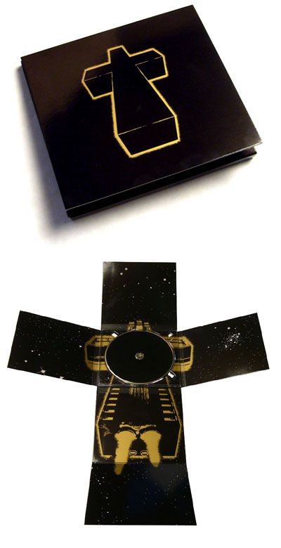
Indie Example 2:
- The neon cross on the cover of the case could represent that the fans follow the band as if they are a religion.
- The front cover does not even include the name of the band or album, only the religious 'Cross' imagery that has become synonomous with the band - with reference to track titles such as 'Genesis' and 'Waters of Nazareth'. They don't need their name in massive letters to be recognised, only a simple cross logo.
- The Digipak then folds out with 6 panels to create a larger cross shape, with no text inside, only alternative artwork of the neon cross now shown as a spaceship flying through space - with stars shown on all the adjoining panels.
 |
| Layout 2 |

Indie Example 3:
- This artist has decided to go for a more intricate layout, with multiple pullouts containing text/logos and imagery instead of the more simplistic designs seen in the previous examples.
- The stone background could represent the industrial electronic feel to their music.
- However it contains the same 'Booka Shade' logo on every panel and pullout in their own signature font which has become their brand, and the CD tries to continue this by having the band name take precedence over the actual album title.
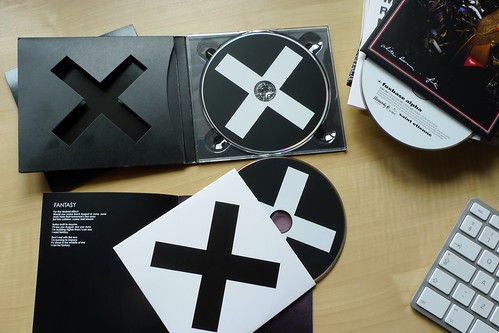
Indie Example 4:
- For the XX the band used a simple black and white X - in alternating colours. This stunningly minimalistic design strongly reflects the bands style of music - simplistic and calm.
- It creates an air of mystique around the band, as it does not contain any information on the front cover as to reveal who the band are or what the album title is.
- In a similar way to the Justice album shown above - the fans are made to recognise the band through a simple logo. Which is a feature I may choose to implement in my own digipak design.
- Another interesting feature is the cut out X on the front panel (shown top left in the picture) when the album of closed this will show the white X on the CD through the gap in cover - giving the digipak some depth and seperates it from the rest of generic jewel cases on sale in the shops.
5 February 2014

24 January 2014
16 January 2014
Digipak research
Rihanna- LOUD

For our music video we must create our own digipack for our artist. therefore I have researched 4 digipak albums to gather ideas for my artists.

Her red lipstick outlines that the album will be about love. Also her face is facing down which states that the album could be about the distress and heartbreaking love relationships. Her facial expressions may also be a way of embracing the songs that she sings by having her eyes closed.
 However, the red roses connotes love and romance which means that the album could be about love perhaps the upbringing of a relationship and the heartbreaking part in a relationship
The entire cover is portrayed in the color red, which would draw people's attention when they walk past it. This is shown as a digipack because of the addition deluxe picture of herself, the CD and the DVD that is included in it and the picture of her represents the star image she is trying to portray herself as. The digipack also includes the making of ' LOUD' presented in the form of a DVD. This includes Rihanna herself singing. The title and the font of the album cover is quite simple and elegant which ties with the close up image of Rihanna.
14 January 2014
Possible Locations


China Town, Camden Town, Wembley and Southbank Skate Park.
These locations are great for different shots and the hustle and bustle of people adds atmosphere. We will be taking a much more conceptual approach to our music video to fit the indie conventions. The miss- en- scenes of these locations are quite retro and as such "hipster"; again fitting the Indie genre.
5 January 2014

4 January 2014
Subscribe to:
Posts (Atom)